
The Sushi Bar is a well-established downtown Toronto restaurant that brings an authentic taste of Japan to the local community through its offerings of fresh maki rolls, tempura, dim sum, and sashimi. Upon reviewing their website, there was a significant gap in their customer experience: the absence of an efficient reservation system. Currently, the only option available for patrons is to fill out a Google Form and await a response.
Comparing this process with that of other popular sushi establishments in the area, there was an opportunity to redesign their reservation system. By enhancing their online presence and streamlining the reservation process, we aim to drive more traffic to the business and ultimately improve overall customer satisfaction.
User Flow
It was essential for me to create a comprehensive visual user flow before diving into the design process. Recognizing the limitations of the current system, where customers lacked control over their actions, I aimed to empower users by providing them with full control over every aspect of the reservation process. The user flow chart showcases the array of actions users can now undertake when booking a reservation, ensuring a seamless and user-centric experience.
Low Fidelity Wireframe
The initial concept introduced a straightforward, six-screen layout designed to guide users seamlessly through their reservation journey, mirroring the steps outlined in the Flow Diagram. The focus was on providing clear visibility of each action, rectifying the lack of guidance previously evident. This structured design ensures an intuitive and comprehensive navigation path, significantly improving the user interaction with the reservation system.
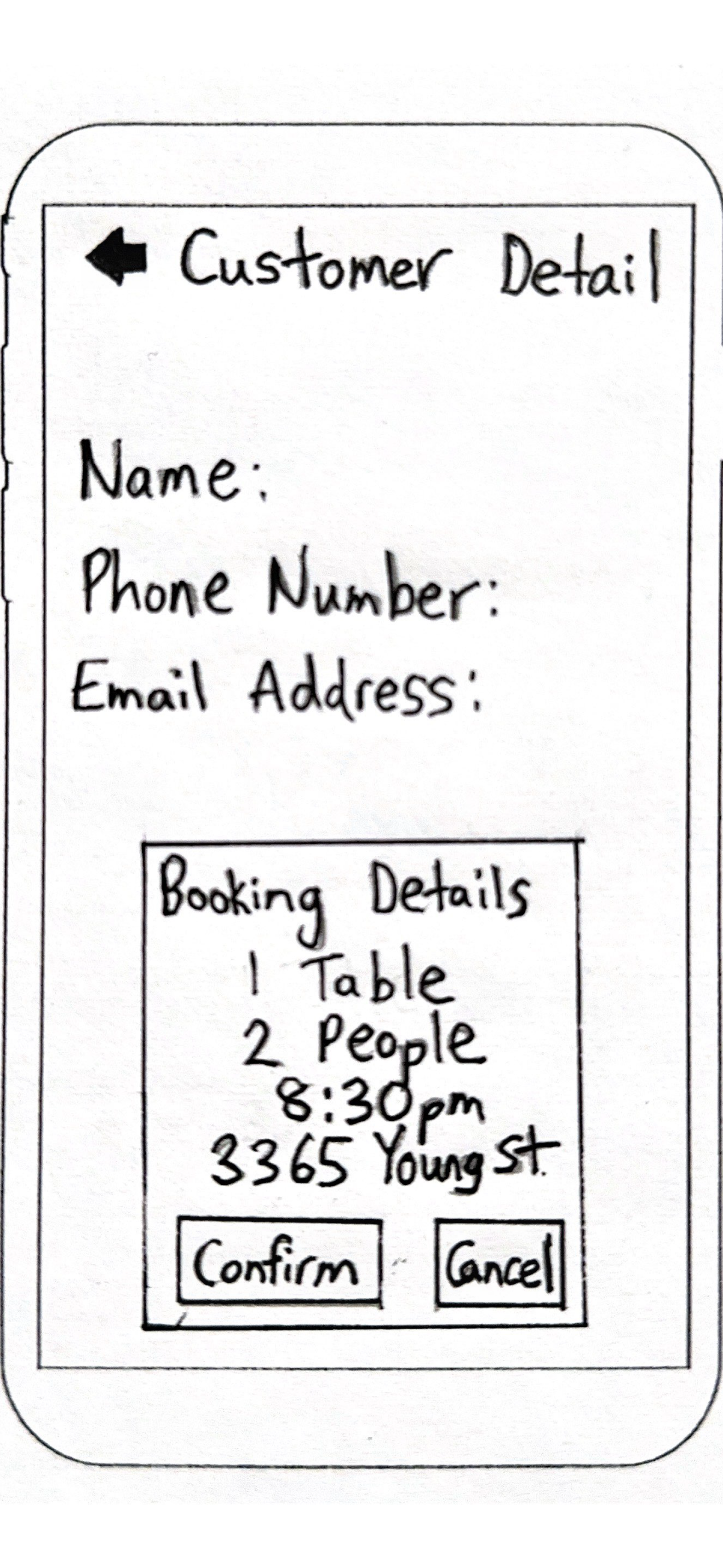
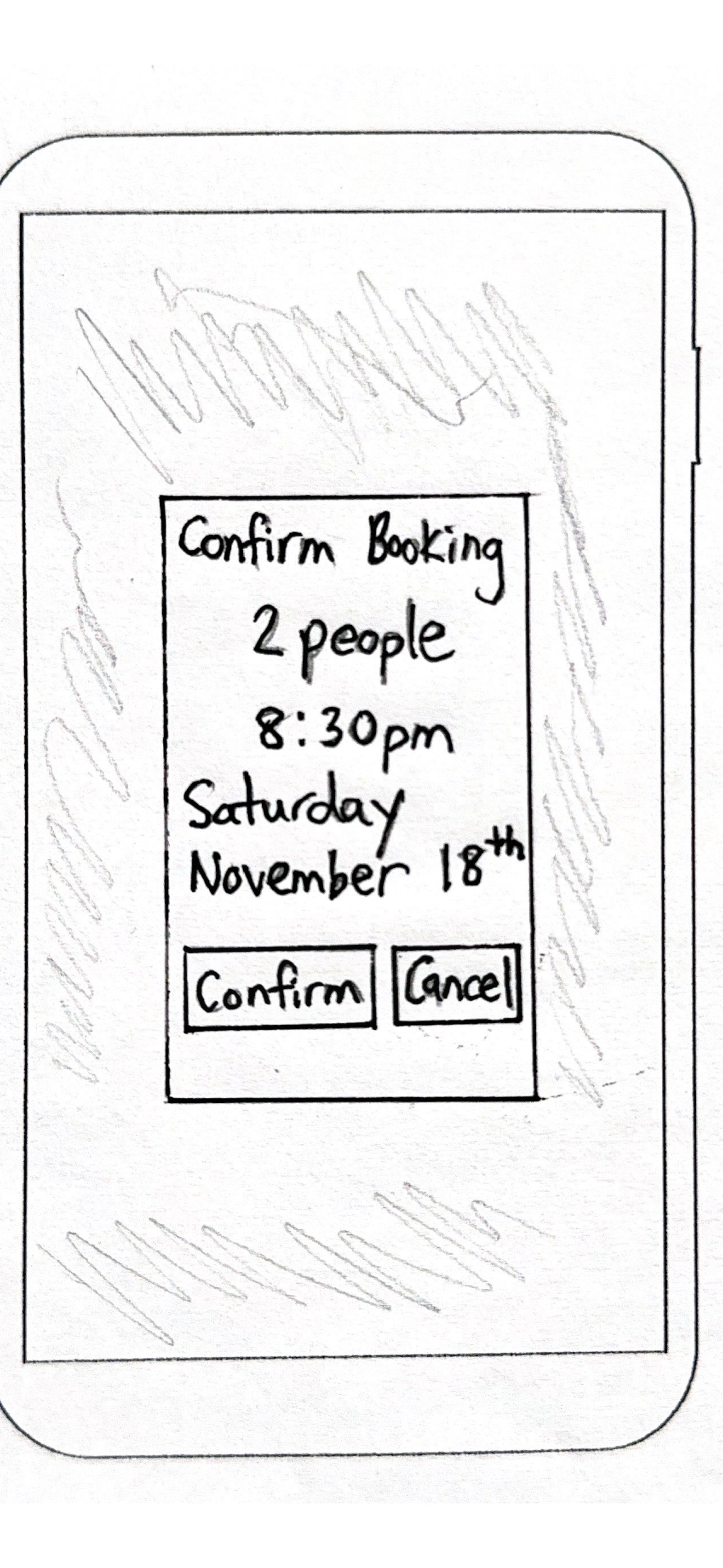
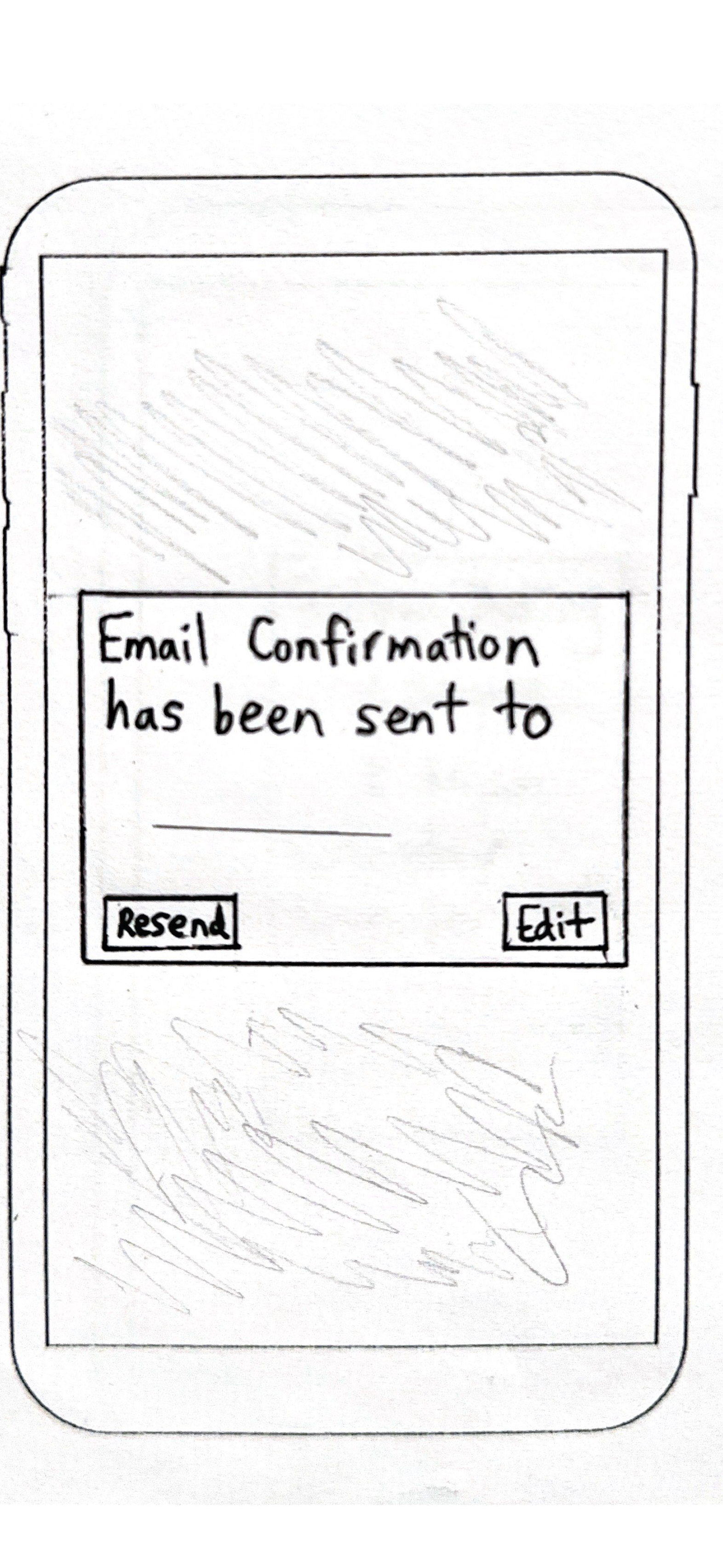
Mid Fidelity Wireframe
The mid-fidelity wireframe marked the initial introduction of color, aiming to align with the original business’s brand palette. Upon adding the table, a noticeable amount of empty space emerged. To adhere to the initial concept of ensuring complete visibility, an animation featuring chopsticks was incorporated to provide users with interactive feedback throughout the process.
Usability Testing results
After introducing color to the visual design of the mid-fidelity prototype, my objective was to conduct usability testing to observe how individuals responded to the updated design and whether it resonated with their understanding of the system.
#1 Colour Overload
Upon receiving initial feedback, it was noted that there was an overwhelming presence of green, which detracted from the user’s navigation experience, causing dissatisfaction.
#2 Crowded space
The second aspect of the feedback addressed the perceived overcrowding within the layout. As the initial designs were primarily tailored for a mobile website, the constrained space led to a cluttered appearance.
#3 Small visual elements
Building on the previous point, the initial designs incorporated small visual elements like arrows and text boxes due to the limited space on mobile screens. This theme consistently emerged across all three usability tests.
Final Prototype
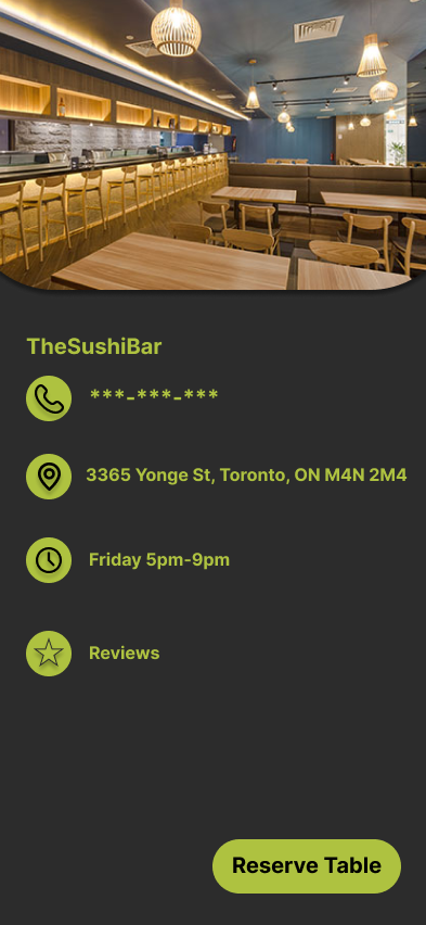
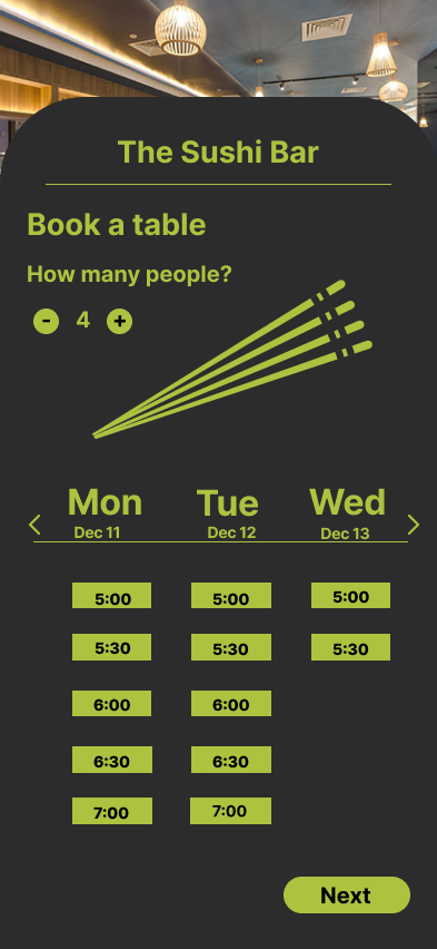
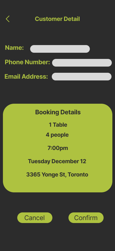
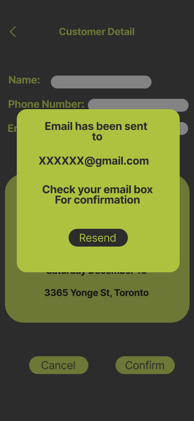
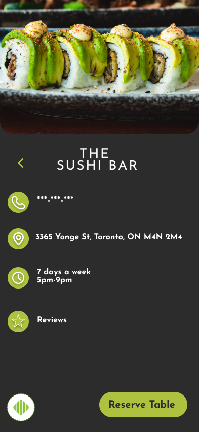
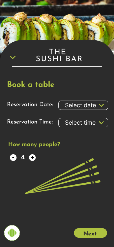
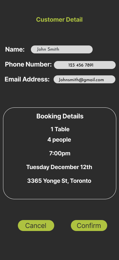
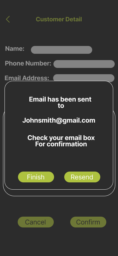
Upon reviewing the usability feedback and data, it was evident that the design suffered from excessive noise and distractions. To address this, significant steps were taken to declutter the interface. This involved reducing the colour palette and introducing more breathing space. Eliminating the table in favour of a dropdown menu freed up additional workspace. Furthermore, the intensity of the green was toned down and harmonized with a neutral white hue to achieve a balanced colour contrast. The resulting final design is sleeker and more visually appealing, while remaining faithful to the original user flow established at the project’s outset.
TheSushiBar Reservation Demo
The final demo prototype provides a firsthand perspective as the user navigates through the process of booking a reservation at TheSushiBar, following the steps outlined in the user flow precisely.